Do you have multiple labels 🏷?
And, are you tired of cloud ⛅ and listing options available in blogger?
Want to do something creative 💥?
Why not show all categories in one page?
Today, we are going to build a custom page and add category or tags available in your blog. Though adding different tags or labels a manual process, it should not take much time to create such pages. You can even limit number of labels you want to visualize. Full control.
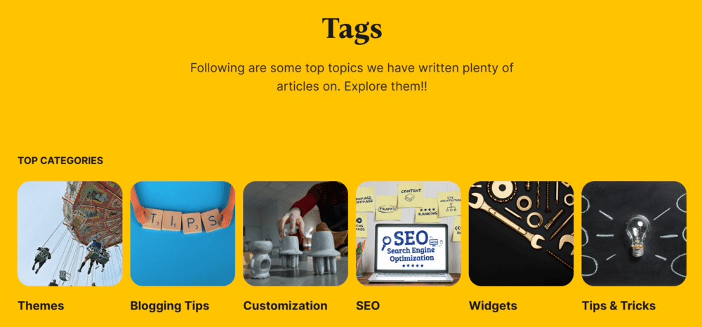
So, what is a category or tags page?
Category or Tags page displays different labels in one place with some information about that particular topic. It helps readers easily navigate through your blogger blog. Here's a demo on how it looks:

In case, you still want to stick with cloud or list method, follow this tutorials:

![Customize Default Label List Gadget in Blogger [100% Stylish] - TwistBlogg - Premium Blogger Tutorials and Widgets](https://blogger.googleusercontent.com/img/b/R29vZ2xl/AVvXsEjU3D3Np-UcAkc604gUL1Tc3oB2ckYpUfgxlhm35JWOAA4uF6P6yOWHda-KgIyjiMiZgD6s4TrB71kBPxOM27rlKxgbVJ_D6IrzAQ6AFob3xMiBlgXXchQ-twhNy6ObHlBl1Wk6IioPPZ5f/w0/customize+default+label+list+gadget+blogger.png)
Adding label page in blogger
First we create a simple page from Page section and title it Tags. Later we add codes to that page.
Step 1: Creating a Tags Page in Blogger
Go to Blogger > Pages > New Page and Enter the title "Tags" . Click on Page Settings, modify the page settings as shown below.

Step 2: Adding HTML and CSS Codes for Category Page
Switch to HTML Editor and Press CTRL + A, remove existing code and paste the following code. Hit Publish and you're done.
Make sure to change your custom images and labels addresses respectively.
This is CSS code.
<style>/* Custom Label Page for Blogger by TwistBlogg.com */
.label-page-header {
  padding: 11vh 0 11vh;
  text-align: center;
  margin-top: -40px;
  width: 100vw;
  margin-left: calc(50% - 100vw / 2);
  margin-right: calc(50% - 100vw / 2);
}

.header-title {
  font-size: 6.6rem;
  line-height: 1.25;
  margin: 0;
}
.header-text {
  max-width: 880px;
  padding: 0 5vw;
  margin: 3vh auto 0;
  line-height: 1.5;
  display: block;
  font-size: 2rem;
}

.subtitle {
  display: flex;
  margin-bottom: 4vh;
  padding-top: 1.8vh;
  margin-top: 5px;
}
.subtitle-text {
  font-size: 2rem;
  line-height: 1.1;
  flex: 1 0 50%;
  max-width: 800px;
  margin: 0;
}
.label-wrapper {
  display: grid;
  width: 100%;
  gap: 16px;
  grid-auto-columns: 1fr;
  grid-gap: 16px;
  will-change: transform;
  margin-bottom: 16px;
  grid-template-columns: repeat(3, 1fr);
}
.item.is-loop {
  margin-bottom: 5.2vh;
  will-change: transform;
}
.item-image {
  margin-bottom: 2vh;
  transition: transform 0.3s ease;
  aspect-ratio: 1/1;
}
.item-image:hover {
  transform: translateY(-3px);
}
.item-image img {
  width: 100%;
  height: 100%;
  -o-object-fit: cover;
  object-fit: cover;
  border-radius: 26px;
}
.item-content {
  display: flex;
  flex-direction: column;
  box-sizing: border-box;
  padding-right: 2.5vw;
}
.item-title {
  font-family: "Inter", sans-serif;
  font-size: 3rem;
  font-weight: 700;
  line-height: 1.3;
  margin: 1vh 0 0;
  margin-top: 1vh;
  max-width: 490px;
}

.item-title a {
  color: inherit;
  text-decoration: none;
}

@media (min-width: 1481px) {
  .label-wrapper {
    grid-template-columns: repeat(6, 1fr);
  }
}

@media (max-width: 1480px) and (min-width: 1281px) {
  .label-wrapper {
    grid-template-columns: repeat(5, 1fr);
  }
}

@media (max-width: 1280px) and (min-width: 1025px) {
  .label-wrapper {
    grid-template-columns: repeat(4, 1fr);
  }
}

@media (max-width: 1280px) {
  .item.is-loop {
    margin-bottom: 3vh;
  }
  .header-title {
    font-size: 5.5rem;
  }
  .item-title {
    font-size: 2.4rem;
  }
}

@media (min-width: 1025px) {
  .label-wrapper .item-title {
    font-size: 2.4rem;
  }
}

@media (max-width: 1024px) and (min-width: 769px) {
  .label-wrapper {
    grid-template-columns: repeat(3, 1fr);
  }
}
@media screen and (max-width: 1024px) {
  .label-page-header {
    padding-top: 3vh;
  }
  .header-text {
    max-width: 720px;
    font-size: 1.8rem;
  }
  .label-wrapper {
    grid-template-columns: repeat(2, 1fr);
  }
}
@media (max-width: 1024px) and (min-width: 769px) {
  .label-wrapper {
    grid-template-columns: repeat(3, 1fr);
  }
}

@media screen and (max-width: 768px) {
  .header-title {
    font-size: 4.8rem;
  }
  .item-content {
    padding-right: 3vw;
  }
  .item-title {
    font-size: 2.2rem;
  }
}

@media screen and (max-width: 500px) {
  .label-page-header {
    padding-bottom: 8vh;
  }
  .header-title {
    font-size: 3.4rem;
  }
  .subtitle-text {
    font-size: 1.6rem;
  }
  .label-wrapper {
    margin-bottom: 6vh;
  }
  .item-title {
    font-size: 2rem;
  }
}
</style>
This is HTML Code:
<div class="label-page-header">
<h1 class="header-title">Tags</h1>
<p class="header-text">Following are some top topics we have written plenty of articles on. Explore them!!</p>
</div>
<p><div class="subtitle">
<small class="subtitle-text">
<span>TOP CATEGORIES</span>
</small>
</div>
</p>
<div class="label-wrapper">
<div class="item is-loop">
<div class="item-image">
<a href="/search/label/Blog%20Themes" aria-label="Blogger Themes">
<img src="https://blogger.googleusercontent.com/img/b/R29vZ2xl/AVvXsEjXQ0J1Bx12qLKiw4GYBSpJCdUu5kNclt-3iDTQjZYdewwc9VQj1g6P84uYIOVdxkkhAnPuTQ3XJqSoJ17w5lDtlqe1X0VOxjrNpU6EbEy5teLIz7caBzLmFKvlPn1B-XD2T-zYn6e-lRYz32jeFRs_ACZa_oZKwBOnfqqSjf8EKf9wP7KC0XXPxEIRyQ/s640/Bloggerthemes.jpg" alt='Blogger Themes'/></a> </div>
<div class="item-content">
<h2 class="item-title"><a href="/search/label/blog%20Themes">Themes</a></h2>
</div>
</div>
<div class="item is-loop">
<div class="item-image">
<a href="/search/label/Blogging%20Tips" aria-label="Blogger Tips">
<img src="https://blogger.googleusercontent.com/img/b/R29vZ2xl/AVvXsEg40GR-h0jTIWjCHvPz4tga4xd5nOEu_eSZCBsqYzBnbK_2VZOuMnLifxBgay5vK4pVTvY9CmL-T0uPM_5qUH0m04fhDOdyAv1roL6lxI9W0dU-iPHUZQQ0ysQO8ptLQPkxuxxDajFZLFqIEnYSg_7DEWV0xluloqpAmY42DuwOfX_bXYPnJb7Fsb2kdw/s6000/pexels-ann-h-2789779.jpg" alt='Blogger Tips'/></a> </div>
<div class="item-content">
<h2 class="item-title"><a href="/search/label/Blogging%20Tips">Blogging Tips</a></h2>
</div>
</div>
<div class="item is-loop">
<div class="item-image">
<a href="/search/label/Blog%20Customize" aria-label="Blogger Customize">
<img src="https://blogger.googleusercontent.com/img/b/R29vZ2xl/AVvXsEiLD_Dd4CZuUv0D0swI9H2De71zVKmxuHG2xbe79Cf1IrHIIMUt6Giub8KMPfbmrpNEtYQ3Ch2CtzLPxZr0prJqryo3nS0Q4JtaNj4gYAhr7lgi4gVnE4GnFq-rUq6bjPv557ARReCJzMzlBHFhKUgs2JMVRThnwLKUYyF0M8ksmiXmGtUwNXk_R_n3nA/s6720/pexels-thirdman-7180819.jpg" alt='Blogger Customize'/></a> </div>
<div class="item-content">
<h2 class="item-title"><a href="/search/label/Blog%20Customize">Customization</a></h2>
</div>
</div>
<div class="item is-loop">
<div class="item-image">
<a href="/search/label/SEO" aria-label="SEO">
<img src="https://blogger.googleusercontent.com/img/b/R29vZ2xl/AVvXsEiQomC1y-x8-33u1zfq-HKWCQXDAzDyd2DzgoeuZi7XOdYd3GAPGrjir8SxiejTiWb0R8wVdi7cbVmMjsP6rcNukNlPdTMMMl9Hmozf5AIJls8xfY_0_506UDSJCDwLG6cOf53h9LvFHJYJX7f5ax22jxvsFJ6rBZr4aE9YYhWkrWRETsw2MJlyfJkhLg/s1920/search-engine-optimization-4111000_1920.jpg" alt='SEO'/></a> </div>
<div class="item-content">
<h2 class="item-title"><a href="/search/label/SEO">SEO</a></h2>
</div>
</div>
<div class="item is-loop">
<div class="item-image">
<a href="/search/label/Blog%20Widgets" aria-label="Blogger Widgets">
<img src="https://blogger.googleusercontent.com/img/b/R29vZ2xl/AVvXsEhT1FzDrmSCcPY9Tckxt39PiJHpcHpy_ujfvB1XzZ8bpuptKomfLArowsSvXd4-C7YSvU_gVSk62IZsjw1msnZMwBRBhz37Xy3HLnXKHMncv4Tzz6qY8Og70Fsum8zM89Wi9c3Ug6Priy-Z3YNJXsjAMcsmJqGpe6FvGEZtgsY2r_FA_E-pC8pVj-5XcA/s6016/pexels-miguel-a%CC%81-padrin%CC%83a%CC%81n-3930091.jpg" alt='Blogger Widgets'/></a> </div>
<div class="item-content">
<h2 class="item-title"><a href="/search/label/Blog%20Widgets">Widgets</a></h2>
</div>
</div>
<div class="item is-loop">
<div class="item-image">
<a href="/search/label/Tips%20and%20Tricks" aria-label="Tips And Tricks">
<img src="https://blogger.googleusercontent.com/img/b/R29vZ2xl/AVvXsEiVigEMB0CRsOozCO2aXjBbMkGLP0nNAzzDjY3-99eGeTqNHKyyl8mp83ADpWkruLb_Fj600LDzLySzs-W1e7iX4R7NMcFNrkxGdIH-ckVkl76TScROclgzoOFHfBW9_n8h_22DyQoy_jpMrYBRUBoe-MKQ6SEv4L8ltX0lBAcy1JijCZtZVdeIkenFrg/s2400/pexels-pixabay-355948.jpg" alt='Tips And Tricks'/></a> </div>
<div class="item-content">
<h2 class="item-title"><a href="/search/label/Tips%20and%20Tricks">Tips & Tricks</a></h2>
</div>
</div>
</div>That is all. You have a responsive fully functioning Category page in your blog. Now, add a navigation in your blog and link it to label page. Happy Blogging 💣💪